 Here at Flow we have been writing about and advising on making websites mobile friendly for a few years now (see our original article from 2012). Up until recently it has been fairly easy for clients to say it is not a priority or not relevant to them as their mobile access percentage may still be relatively low or they feel their primary market is not using mobile devices to access their website.
We are now consistently seeing mobile access rates of 30% or more for the vast majority of sites we manage. Be it mobile phone, tablet or other mobile devices that is 1 in 3 people visiting the majority of sites is doing so on a mobile device. On some sites these figures are now topping 70% or higher.
So that is pretty significant in itself and these figures are only going to go up not down. But here is something just as significant, recently we started receiving these notifications from Google:
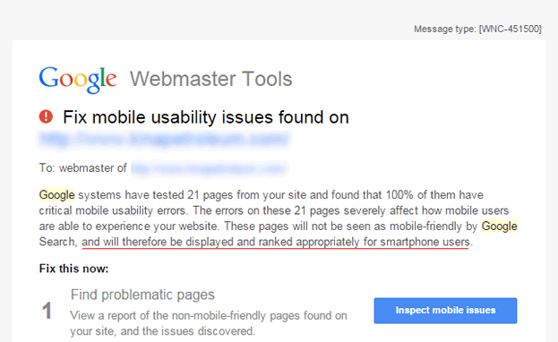
So this is Google actively telling you, the site owner, that they are seeing your site as not mobile friendly and "will therefore by displayed and ranked appropriately for smartphone users".
In simple terms if your site is not what Google considers to be mobile friendly then it is going to take a negative hit in the search results for every search done on a mobile device. With a global percentage of nearly 30% of all internet traffic coming from mobile that is a lot of searches you could be getting penalised for.
Not having a mobile friendly site is potentially like turning away one in three customers that turn up to your door. Google is now flagging mobile friendly sites in the search results (on mobile) and for competitive terms we are seeing the majority of the top results being sites that are mobile friendly ranking higher than those that are not. While this may not be applying to all keywords and searches these notifications from Google are a clear signal (which is unusual from Google) that this will become more significant as time goes on.
Making an existing website mobile friendly can be quite easy and does not have to break the bank. If you already have a fairly modern website chances are it can be made mobile friendly using the existing site.
If your site is a little older then now might be a good time to look at whether it is worth revamping your site and making sure it is mobile friendly at the same time...a win, win.
Out method for making a site mobile friendly (and the one recommended by Google) is to make your site "responsive". A responsive website is one that will adapt to fit the users screen size. The site is coded so that the width of the main site and the elements within it will resize and rearrange to suit the screen it is being viewed on.
The benefit of this style of site is you still only have one set of templates and code and one set of content making the site as easy to manage as a normal site.
The site you are currently reading is "responsive" try resizing the browser window width inwards to see how the site adapts and changes to fit the screen.
We are here to help. Flow has created many mobile friendly websites for our clients and can help you to understand the options available.